Social issues
Social issues in media are about how different types of media, like TV, newspapers, and social media, show and affect public views on societal problems, such as inequality, mental health, politics, and the environment. Media can help by raising awareness and promoting change, but it can also spread stereotypes or false information. How these issues are shown in the media can influence people's opinions and actions, making the media important in dealing with or worsening social problems.
Social issues mind map

The spread of false or misleading information, especially during elections, can influence public opinion and harm democracy.
In media, identity is shown through various elements. These elements help convey individual collective identities, shaping how characters groups, or cultures are portrayed and understood. Some elements of identity may include:
1. race and ethnicity
2. gender
3. sexual orientation
One example of the use of consistent identity is the organisation 38 Degrees.


38 Degrees is a UK-based nonprofit organization that empowers people to take collective action on social, political, and environmental issues through grassroots campaigning. Founded in 2009, it allows individuals to start and support petitions, lobby politicians, and participate in campaigns on matters like protecting the NHS, climate change, and corporate accountability. The organization also uses crowdfunding to support legal challenges and offline activism, working to ensure that ordinary citizens can influence decisions that affect their lives.
What is the use of identity in campaigns?
- Use graphs, charts, and tables to display quantitative results. These elements can help visualise trends and relationships and communicate exact values.Joint displaysUse a side-by-side joint display to present qualitative and quantitative results together. For example, you can present qualitative implementation characteristics next to quantitative screening rates.

- Encourage Solidarity: It called on oppressed people in Nazi-occupied countries to join the fight against fascism, with the Soviet Union leading the way.
- Boost Morale: The poster aimed to strengthen the Soviet people's spirits by showing their role in a global struggle against tyranny.
- Global Resistance: It promoted the idea that the Soviet Union was fighting not just for Russia, but for the liberation of all oppressed people.
When and Why:
Designed in 1942, at a crucial point in the war when the Soviet Union needed to rally support and motivate its people to continue fighting against the Nazis.

The poster Oppressed Peoples of the Whole World was designed by Gustav Klutsis in 1942 during World War II. It was created as Soviet propaganda to rally support for the Soviet Union’s war effort against Nazi Germany and to promote solidarity with oppressed peoples worldwide, especially those under Nazi occupation.
This poster interests me because
Powerful Propaganda: The poster is a striking example of how art was used for political purposes. Its bold design and messaging show the intersection of art and activism.
Historical Context: Created during a pivotal time in World War II, it reflects the urgency of the moment and the Soviet Union's effort to rally global support against fascism.
Constructivist Art: If you're interested in art, this poster showcases the Constructivist movement's use of modern design, photomontage, and bold graphics to communicate complex political messages.
Global Message: The idea of international solidarity and resistance to oppression might resonate with contemporary global struggles for justice and freedom.

This poster was designed by Vladimir and Georgii Stenberg, who were part of a group of artist-engineers in early Soviet Russia. The brothers created posters to promote films, incorporating the constructivist style. The poster features a montage of various drawings and designs from the film, using contrasting colours, simple shapes, and geometric patterns. It also strongly emphasizes technology, particularly the camera, a recurring theme in constructivist art.
I find this poster interesting because it captures the essence of the early Soviet Constructivist movement, blending art with technology in a visually striking way. The use of bold geometric shapes and contrasting colours immediately grabs attention, and the montage of drawings from the film adds a dynamic, layered feel. What stands out to me is the strong emphasis on technology, especially the camera, which reflects the movement's fascination with modern industry and its belief in art as a tool for social change. The way the Stenberg brothers fused art, design, and cinema is innovative and thought-provoking.
Designers who are inspired by Constructivism
Shepard Fairey

Shepard Fairey is an American contemporary artist, graphic designer, and activist, best known for his iconic Obama "hope" poster and the street art campaign Say Yes, creating thought-provoking and constructive posters that address social, political, and environmental issues.
Shepard Fairey drew inspiration from Constructivism by using bold shapes, simple colour schemes (like red, black, and white), and strong text to create eye-catching, socially focused art. His work, like the Obey Giant campaign, reflects the movement’s goal of combining art and activism to inspire change.

I find Shepard Fairey’s Constructivist-inspired designs incredibly impactful, with their bold visuals and strong messaging that effectively communicate social and political ideas.




Surrealism is an art movement that started in the 1920s, led by artists like Salvador Dalí and René Magritte. It focuses on creating dreamlike, bizarre images that break the rules of reality. Inspired by psychoanalysis and Sigmund Freud, surrealists wanted to explore the unconscious mind, dreams, and irrational thoughts. They combined everyday objects in strange ways to challenge logic and show deeper, hidden meanings. In short, surrealism is about using art to explore the strange and unreal aspects of life.
Surrealism is used in campaigns because it grabs attention and makes a strong impact. Its unusual and dreamlike images stand out, making people curious and emotionally engaged. Surrealism can also creatively express complex ideas that are hard to do with regular visuals. It helps campaigns challenge traditional ideas and be seen as bold or innovative. Overall, surrealism makes campaigns more memorable and effective in catching people's interest.
Lex Drewinski

The "Poor and Rich" poster by Lex Druinsky was created in 1932 as Soviet propaganda. It aimed to show the stark differences between the wealthy capitalist class and the poor working class, encouraging people to support the new socialist system in the Soviet Union. The poster was part of a campaign to promote socialism, highlight the struggle between classes, and criticize the old capitalist system that the Soviet Union had replaced. It was created to inspire unity and push for a more equal society.
Surrealist poster:

I began by opening Photoshop and creating a new A4 document to start my design. I imported a flower image I found online and then opened an eye image in a separate Photoshop file.
After extracting the eye, I placed it onto the flower as a new layer. I merged the layers and refined the edges to ensure the eye blended seamlessly with the flower. I centred the eye on the flower, adjusted its colours, and blended it with the petals to make it appear as a natural part of the flower.
Next, I added text and customized its shape to fit the composition.
Looking back, the image could be enhanced by incorporating more flowers to create a more visually captivating effect.
Social campaign pitch
digital detox
- The objective of this campaign is to make people aware of the negative effects of too much tech use and to encourage healthier habits. It aims to help people set limits with technology, improve mental health, strengthen relationships, and focus on real-life connections.
- The key message I am trying to spread is that technology can affect social skills and real-life relationships and to take a break from screens and reconnect with what actually matters
- This campaign was created in response to growing concerns about the effects of excessive tech use on mental health and relationships
- This campaign is supposed to be relatable warm and supportive
- I aim to include elements like having campaign hashtags and using social media to attract the right target audience which are parents who are concerned for their children and teens.
- Examples of other organisations include digital detox, screen-free week, common sense media
- The primary research I should do is surveys and questionnaires, interviews, focus groups and social media analysis
- Secondary research I should do is look at reports and news articles
- I think this should be successful because it is a growing public concern and increases focus on mental health

- media has a strong effect on everyone
- Audiences are easily influenced and all respond in the same way.
- Example: Governments use propaganda during wars to shape public opinion.


- interview questions
- lighting
- location
- props
- target audience

Creating my vox pop allowed me to learn people's thoughts on technology and how it affects them. Planning my vox pop by preparing questions, location, lighting and more allowed me to get a good idea of how it would turn out.
The open-ended questions worked well, this allowed them to give relatable and thoughtful questions to the audience. They addressed important aspects of technology, like daily use, relationships, and future concerns, making the interviews engaging.
Filming in the classroom helped create a comfortable environment for my interviewees. The neutral backdrop suited the theme, but the occasional background noise posed a minor challenge.
The classroom’s natural and artificial lighting created a relaxed atmosphere. While effective, I could have improved the visuals by experimenting with additional lighting equipment and having a better camera instead of using my iPhone.
Using my iPhone 13 and a wired headphone microphone was practical and ensured clear audio. However, holding the microphone was slightly distracting for interviewees, so a clip-on mic could improve future projects.
The project successfully reached my target audience—technology users—by addressing relatable topics and encouraging reflection on how technology impacts their lives.
Overall, I am proud of the outcome. The planning paid off, and I learned valuable lessons about filming and interviewing. Next time, I would manage environmental factors better and enhance audio and visual quality by using a camera.


My poster, “Digital Detox,” reminds us to take a step back from the overwhelming presence of technology in our lives. The bold words “Pause. Breathe. Unplug.” are central to the message. “Pause” encourages people to stop and reflect, “breathe” serves as a reminder to stay grounded and present, and “unplug,” highlighted in red, emphasises the importance of disconnecting from devices to focus on ourselves and the world around us.
Through this design, I want to inspire others to take intentional breaks, rediscover balance, and reconnect with what truly matters outside of the digital world.
I explored how media influences social issues and identity. I covered significant topics like racial stereotypes, body image, and climate change, examining how media can raise awareness while also spreading misinformation. To organize my ideas, I created a mind map, which helped me draw clear connections between these issues. However, I feel this section could have been stronger if I had included more about the role of media literacy in addressing these challenges.
When discussing elements of identity, I analyzed how media portrays aspects like race, gender, and sexual orientation. I used 38 Degrees as an example to show the importance of consistent branding in building identity, which I think was effective. Still, I could have included more diverse examples to demonstrate how media representations influence society as a whole. Campaigns like #MeToo, This Is America, It Gets Better, and Dove’s “Real Beauty” illustrate the power of tailored messaging across different platforms, including social media, music, and traditional outlets, to drive social change. These campaigns not only raise awareness but also inspire positive shifts in perception.
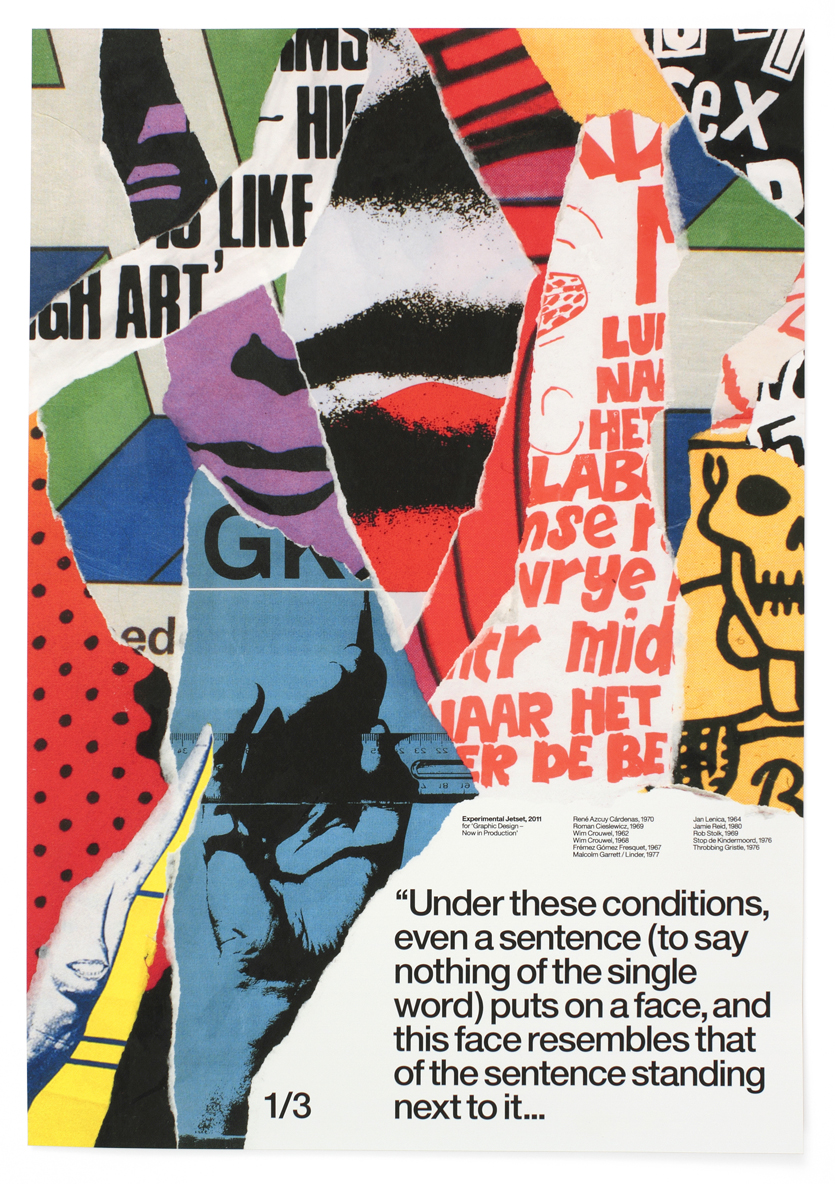
To add depth, I researched Experimental Jetset, whose minimalist designs emphasize identity through visual storytelling. Their work inspired me to consider how design elements can engage audiences in meaningful ways. While this section analyzes identity effectively, I believe addressing long-term campaign success and balancing inclusivity could have strengthened my points further.
In another part of my coursework, I reflected on primary and secondary research. I explained the differences clearly, using examples like interviews and surveys for primary research, which are more time-intensive but offer unique insights, and books or journals for secondary research, which are faster but less confidential. I also highlighted the pros and cons of each method and discussed the importance of referencing, focusing on the Harvard style to ensure proper credit and avoid plagiarism. While I believe this explanation was solid, I could improve by providing examples of how I might apply these research methods in future media projects.
I also explored the Constructivist art movement, learning how it used design for political and social change during World War II. Posters by Klutsis and Lissitzky stood out for their bold and impactful messaging. The Stenberg brothers’ Man with the Movie Camera poster inspired my own design approach. For my Constructivist-inspired poster, I used a simple colour palette—red, black, and white—with strong text to convey a clear message. This experience taught me that design is not just about aesthetics but about creating something that makes people think and feel.
Surrealism was another area I enjoyed exploring because of how it challenges reality with dreamlike imagery. Artists like Salvador Dalí and René Magritte used surrealism to delve into the unconscious mind, creating art that feels both strange and thought-provoking. For my surrealist-inspired poster, I used Photoshop to blend a flower and an eye into a single image. I think this worked well, but adding more visual elements, like additional flowers, could have made the design more striking.
For my social campaign pitch, I focused on promoting a digital detox to encourage people to limit screen time and improve their mental health. I believe this campaign could be effective, as concerns about excessive tech use are growing. To strengthen my pitch, I plan to use primary research, like surveys, and secondary research from credible reports. Audience theories, such as the Hypodermic Needle Theory and Two-Step Flow Theory, also informed my approach. I found the Two-Step Flow Theory particularly relevant today, as influencers often shape public opinion and guide decision-making.
Creating my vox pop project allowed me to explore how people feel about technology and its impact on their lives. I prepared open-ended questions on relatable topics like daily tech use, relationships, and the future of technology. Filming in the classroom provided a comfortable setting, though background noise was a minor issue. While the lighting was decent, experimenting with better equipment could improve future projects.
The microphone setup worked, but holding it was distracting for interviewees. Next time, I’ll use a clip-on mic for a more seamless experience. Despite these challenges, the project effectively engaged my target audience—technology users—and encouraged them to reflect on their relationship with tech. I’m happy with the results and learned valuable lessons about filming, interviewing, and managing production environments. I’ll focus on improving audio and visual quality and better controlling the filming setting.

No comments:
Post a Comment